- Average Daily Maximum Temp (°F)
- Average Daily Minimum Temp (°F)
- Days w/ maximum temp > 50°F
- Days w/ maximum temp > 60°F
- Days w/ maximum temp > 70°F
- Days w/ maximum temp > 80°F
- Days w/ maximum temp > 90°F
- Days w/ maximum temp > 95°F
- Days w/ maximum temp > 100°F
- Days w/ maximum temp > 105°F
- Days w/ maximum temp < 32°F
- Days w/ maximum temp < 50°F
- Days w/ maximum temp < 65°F
- Days w/ minimum temp < 32°F
- Days w/ minimum temp < -40°F
- Days w/ minimum temp > 60°F
- Days w/ minimum temp < 65°F
- Days w/ minimum temp > 75°F
- Days w/ minimum temp > 80°F
- Days w/ minimum temp > 90°F
- Total precipitation
- Dry Days
- Days w/ > 0.25 in Precipitation
- Days w/ > 1" Precipitation
- Days w/ > 2" Precipitation
- Days w/ > 3" Precipitation
- Days w/ > 4" Precipitation
- Days w/ > 5" Precipitation
- Heating Degree Days
- Cooling Degree Days
- Growing Degree Days
- Modified Growing Degree Days
- Thawing Degree Days
- Freezing Degree Days
HOW TO READ
TIPS FOR UNDERSTANDING THE CLIMATE GRAPHS
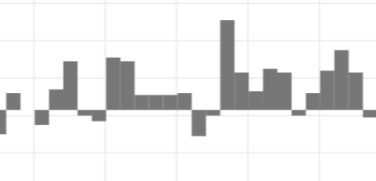
Click the Observations legend button just below the graph to toggle observations on and off in the graph. For annual variables, dark gray bars show observed averages for each year from 1950-2013.
The horizontal line from which the bars extend up or down is the average from 1961-1990.Years when bars extend above the line were higher than the long-term average; years with bars that extend below the line were lower than average.
For monthly variables, observed averages for each month are shown by a black line.
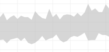
The gray band shows the range of values modeled (hindcast) for 1950–2005. The top edge of the band represents the maximum value modeled at each time step; the bottom edge of the band represents the minimum. All other model results are within the shaded portion.
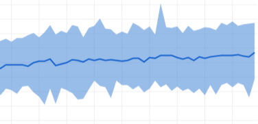
The blue band shows projections for 2006–2100 based on a future in which humans stop increasing global emissions of heat-trapping gases by 2040 and then dramatically reduce them through 2100.
The top edge of the band represents the maximum value modeled at each time step; the bottom edge of the band represents the minimum. All other model results are within the shaded band. The darker blue line shows the weighted mean of projections for lower emissions.
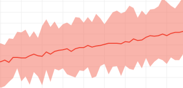
The red band shows projections for 2006–2100 based on a future in which global emissions of heat-trapping gases continue increasing through 2100. The top edge of the band represents the maximum value modeled at each time step; the bottom edge of the band represents the minimum. All other model results are within the shaded band. The red line shows the weighted mean of all projections for higher emissions.
Why do the graphs show wide bands rather than single lines?
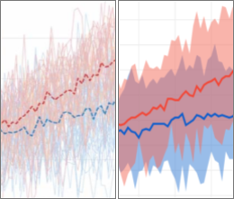
On the left, each single red or blue line shows projections from a single global climate model for one of two possible futures. Lines in shades of red are projections for higher emissions and lines in shades of blue are for lower emissions. On the right, the example from Climate Explorer uses single bands of red and blue shading to show the full range of model results for the same two possible futures.
In Climate Explorer graphs, the top of each color band represents the highest projection among all the models at each time step for each scenario; the bottom of the band represents the lowest projection. The dark median line within each band highlights the trend for each scenario, but it is not a prediction. Future observations are expected to vary across the full range of projections, just as observed values vary from the modeled history.
TIPS FOR UNDERSTANDING THE CLIMATE GRAPHS
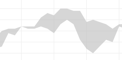
The gray band (Modeled History) shows hindcast annual values for 1970–2005, smoothed by a 10-year rolling average. Edges of the band represent hindcast values; shading shows the difference between the two models.
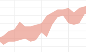
Projections for 2006–2099 are based on a higher emissions future, one in which human emissions of carbon pollution continue increasing through 2100 (also known as RCP 8.5). Annual values from the two climate models have been smoothed by a 10-year rolling average. Edges of the band represent projected values; shading shows the difference between the two models.
NOTE: As the LOCA projections dataset used for the lower 48 does not include Alaska, the Climate Explorer team and climate scientists at the Alaska Climate Adaptation and Science Center selected SNAP Data as the data source for Alaska.
TIPS FOR UNDERSTANDING THE CLIMATE GRAPHS

The gray band shows the range of values modeled (hindcast) for 1950–2005. The top edge of the band represents the maximum value modeled at each time step; the bottom edge of the band represents the minimum. All other model results are within the shaded portion.

The blue band shows projections for 2006–2100 based on a future in which humans stop increasing global emissions of heat-trapping gases by 2040 and then dramatically reduce them through 2100.
The top edge of the band represents the maximum value modeled at each time step; the bottom edge of the band represents the minimum. All other model results are within the shaded band. The darker blue line shows the weighted mean of projections for lower emissions.

The red band shows projections for 2006–2100 based on a future in which global emissions of heat-trapping gases continue increasing through 2100. The top edge of the band represents the maximum value modeled at each time step; the bottom edge of the band represents the minimum. All other model results are within the shaded band. The red line shows the weighted mean of all projections for higher emissions.
ABOUT ISLAND PROJECTIONS
Modeled history (hindcasts) and future projections for Hawai'i and U.S. territories come from CMIP5 global climate model simulations. Raw values from the models have not been downscaled or bias-corrected. Values provided for specific islands and island groups are averages of the three model grid points closest to the geographic center of each territory.
Why do the graphs show wide bands rather than single lines?

On the left, each single red or blue line shows projections from a single global climate model for one of two possible futures. Lines in shades of red are projections for higher emissions and lines in shades of blue are for lower emissions. On the right, the example from Climate Explorer uses single bands of red and blue shading to show the full range of model results for the same two possible futures.
In Climate Explorer graphs, the top of each color band represents the highest projection among all the models at each time step for each scenario; the bottom of the band represents the lowest projection. The dark median line within each band highlights the trend for each scenario, but it is not a prediction. Future observations are expected to vary across the full range of projections, just as observed values vary from the modeled history.